Typographical Tips from Microsoft Publisher
The fact that you have come to this website suggests that
you are a user of Microsoft Word. In one form or another, Word is ubiquitous. If
you buy a new computer, chances are good that it will come with a trial version
of Microsoft 365 (which includes Word) installed. Word is a powerful word
processing program that incorporates many of the features of a page layout
application, but there are times when a page layout or desktop publishing
application is what is needed. Many editions of Office/Microsoft 365 include such a program:
Microsoft Publisher.
Often Publisher will be better
suited to your needs than Word, so it is well worth becoming familiar with it.
It is a very user-friendly application, generally aimed at a more casual, less
professional level of user than Word. But even if you use only Word, Publisher
can be useful to you. Because once upon a time, at least, it came with an
excellent manual. The Microsoft Publisher 97 Companion is a 328-page book
(compare this to the 19 pages devoted to Publisher in Discovering Microsoft
Office 2000 Premium and Professional and the total lack of printed manuals
provided with the software today), and it contains much material that
can be equally helpful to Word users.
For example, the chapter “The Look
of Words” discusses “what fonts are, how to choose them, and how to get the most
from them.” The following tips, guidelines, and rules of thumb are excerpted
from that chapter. [Comments pertaining specifically to
Word are interspersed in brackets. If the order of the text occasionally seems
muddled, it is because much of the text was in marginal sidebars in the
original; in most cases these sidebars have been indented in the text that
follows.]
What’s a font?
A font is all the characters of a single design—that is, a
complete set of all the letters in the alphabet, plus numerals and symbols, as
shown below.
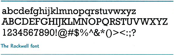
Each
font belongs to a family. Just as the members of a human family have similar but
usually not identical features, so do the members of a font family. One font
might be italic, another bold, and yet another extra-bold. But they all have a
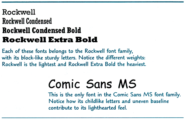
common structure that ties them together. Some font families are large (like
Rockwell); others have just one member (like Comic Sans MS).
Traditional fonts: In traditional typesetting, before the advent of computer
fonts, different sizes of [a typeface] were considered to be separate fonts.
Unlike your computer, which can transform most fonts from tiny to huge with the
click of a mouse, every size of every font resided on its own specifically sized
piece of metal.
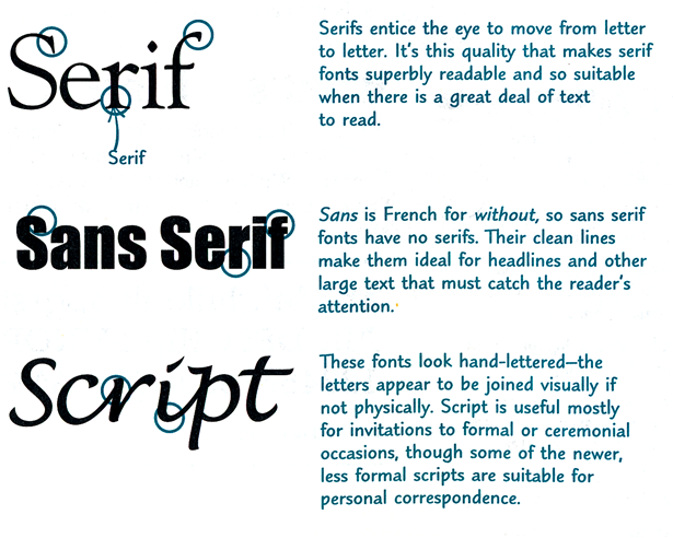
Set in stone: Roman stonemasons chiseled a serif into each stroke
they made in slabs of stone (the “paper” of that time) to correct the uneven
appearance of the letters and to add a graceful finishing touch to the blunt
chiseled edges of the letters.
There are literally thousands of fonts, but designers
usually group them into three categories: serif, sans serif, and script.
Typeface and font: As you read other books about fonts, you’ll encounter the
terms type and typeface, which are generally used interchangeably
with font in the desktop publishing environment.
Font personality
Fonts are like clothing for words. As a man in a black
leather jacket, jeans, and rugged boots conveys a very different image and
feeling than he does in a three-piece business suit, silk tie, and Italian
shoes, so it is with fonts.
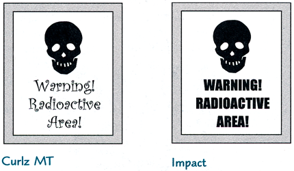
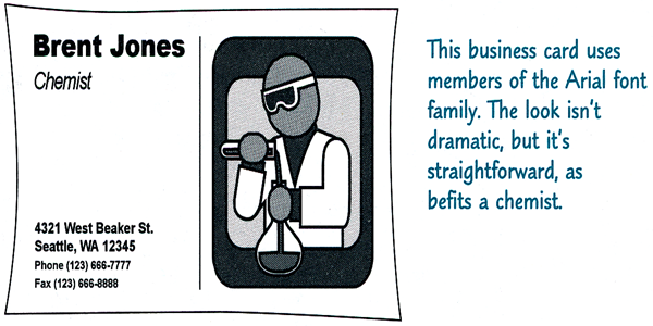
The same words dressed in a
different font deliver a very different message. For example, a mischievous,
informal font, like the one on the left, can undermine a serious message.
Mixing and matching fonts
Choosing fonts is a lot like planning a wardrobe. You start
with some basic fonts that convey the idea and the feeling of your business or
organization, and then from time to time you accessorize with fonts appropriate
for a particular publication. It also probably goes without saying that the
right font means one that you’re comfortable with.
Choosing a basic look
-
Lay the foundation with a couple of fonts that work for
your business and stick with them. Those fonts will form the basis of your
visual identity (along with a logo, if you have one, and the kind of paper
you use), making all your publications instantly recognizable.

-
The goal of good design is communication. Since the
bottom line of good communication is clarity, make sure that you’re clear
about your audience, the point you want to make, and the tone you want to
set. Then choose a font that suits that message.
-
If you’re making a publication that will be
distributed by fax, avoid fonts with elaborate and delicate detail (like
Harrington). The faxing process can fill in the open spaces of the letters
and muddy the detail.
-
Think about the paper you’re using, too. If you
use newsprint, textured paper, or other papers that soak up ink, avoid
delicate, detailed fonts.
Mixing fonts
Sometimes one font isn’t compelling enough to pique and hold
the reader’s interest. The contrast between two fonts can attract the reader’s
eye and help clarify the organization of the piece. For example, designers
usually use a different font for body text—the text that forms the main body of
the publication—than for headlines (also known as display text). The following
rules will help you mix fonts successfully.
-
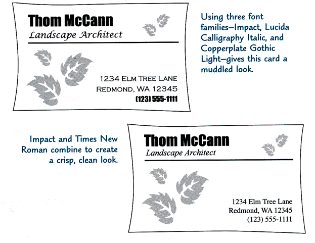
In one publication, don’t mix two serif fonts from
two different families, two sans serif fonts, or two script fonts. If
they’re similar enough, the mix can look like a mistake.
-
Play it safe. If you can’t decide whether fonts
from two families look right together, use just one font family. Use a
lighter weight for body text and a heavier, bold font at a larger size for
display text.
As you gain experience mixing
fonts, there will be times when you know you’ve broken the rules, but you like
what you see anyway. Go with it! It means that you’ve developed your “eye”
enough to create your own look.
The look of body text
As its name suggests, body text is the text that forms the
main body of your publication. In a newsletter or a book, it’s the story. In a
smaller publication, it’s everything that isn’t either a headline or special
text like captions and fancy first letters.
Choosing a font for body text
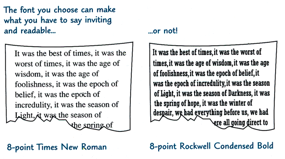
First and foremost, body text must be readable. If the words
aren’t readable, you’ve lost your audience. More subtly, pay attention to the
emotional impact of the font. In the same way that background music in a movie
affects the feeling you have about a scene, the font you choose for body text
affects the mood of your publication and the response of your audience to it.
Also, depending on how much you have to say and how much space you have to say
it in, you might need to consider the compactness of the font. Once you’ve
chosen a body font, stick with it throughout your publication; otherwise you can
confuse your reader.
Readability
We read words by their shapes and not letter by letter, so
readable fonts are those that make it easy for the reader’s eye to scan words
and lines—to read blocks of text. Serifs give words distinctive shapes that the
eye recognizes more easily than it recognizes sans serif shapes. But blocks of
sans serif text can be readable as body text, especially when given plenty of
white space.
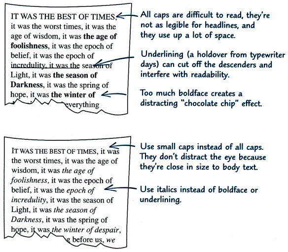
-
Don’t use
script fonts or
fonts meant for headlines. DON’T USE ALL CAPITAL LETTERS or all
italics for body text. They can all be practically impossible to read at
the smaller sizes of body text.
-
A medium-weight font—not too heavy and not too
light—is most readable. If you have a text-intensive page, consider a light
font like Goudy Old Style. If the text is sparse, use a dark font like
Rockwell.
-
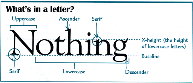
Consider the height of the lowercase letters (the
“x-height,” as it’s known to typographers).
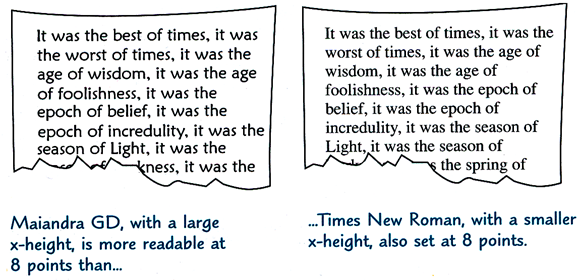
Why “x-height”? As shown in the illustration below, “x-height” refers to the
main body height of the lowercase letters, excluding ascenders and descenders.
But why “x”? Why not “c” or “s”? Because in the letter “x” all the terminals of
the letter touch a line of measurement. Now you know!
Feeling
You might not think of black text as having color. But black
text combined with white space “colors” the page.
Consider the way the color feels
to you and if that’s how you want your readers to feel. A light-colored body
text has a soft, calm feeling; dark text is stronger and more emphatic. Take
your printer into account, too—if it prints on the dark side, you can compensate
by choosing a lighter font.
The “color” of a page is also
affected by the space between the lines (known as leading, pronounced “ledding”).
Add space between the lines to lighten the page and give it an airier
feeling; decrease the line spacing to darken the page.
[In Word, line spacing is adjusted in the Paragraph dialog.]
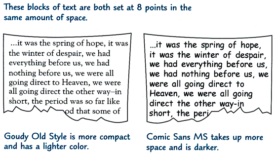
Compactness
The number of characters per line varies from one font to
another even when the same font size is specified. If you have a lot of
information to fit into a small amount of space, choose a compact font.
Formatting body text
You can save yourself a lot of time and effort and easily
keep the formatting consistent throughout your publication if you use text
styles, particularly if your publication has more than a handful of pages.
Font size
Make all body text within a publication the same
size—between 10 and 12 points is the norm; smaller text can be difficult to
read. Obviously this doesn’t apply if your publication is a poster that’s meant
to be read at a distance or a newsletter for people with low vision.
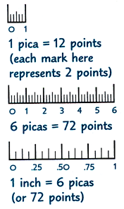
A quick lesson about points, picas, font sizes, and leading
When you’re working in Publisher, it’s helpful to understand
typographic measurements and how they’re used. One inch (2.54 centimeters) can
be broken down into points and picas, as follows:
It seems simple enough when you use
these measurements to determine spacing between lines (leading)—you can easily
use a point scale or a pica scale to measure and verify the number
of points of spacing between lines on your hard copy.
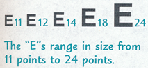
It can get confusing,
though, when you look at font size, which is also described in points (see the
“E”s in the graphic below). You might say to yourself, “That 12-point E
doesn’t look as if it’s 12 points tall!” And you’d be right—it’s not. Font sizes
are measured completely differently than leading, even though they’re both
specified in points, and the only way you can verify font size on your hard copy
is by measuring it against the designated sizes that you’ll find on an
E-scale. Many art-supply stores carry precision rules
that combine a pica
scale, a point scale, and an E-scale in one handy tool.
Space between characters
You can adjust the spacing of letters, or characters, in
your text for a single word or an entire paragraph. [In
Word, you can select Expanded or Condensed on the Character
Spacing or Advanced tab of the Font dialog.]
-
You can lighten the “color” of a text block or improve the
readability of small font sizes or sans serif type by increasing the letter
spacing.
-
You can darken a text block or squeeze a few more words into
a circumscribed space by decreasing, or tightening, the letter spacing.
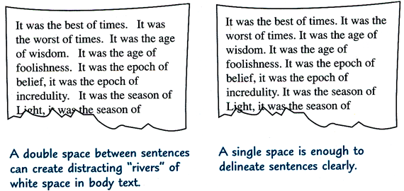
Space between sentences
Current publishing convention puts one space, not two,
between sentences. You can see the spaces on your screen [in Publisher] by choosing Show
Special Characters from the View menu. [For more on displaying nonprinting
characters in Word see
What do all those funny marks, like the dots between the words in my document,
and the square bullets in the left margin, mean?] If you habitually press
the spacebar twice at the end of every sentence, you can remedy the situation by
using the Replace command from the Edit menu.…
The habit of putting two spaces
between sentences is a holdover from the days of typewriters when the typed
characters were monospaced (Courier New is an example of such a font).
That is, the space each letter occupied was as wide as the font’s widest letter.
So, because this created big spaces between some letters, you needed an even bigger space to show that you’d reached the end of a sentence. Today,
however, most fonts are proportional—“skinny” letters take up the least
amount of space and “fat” ones the most, and so one space after the period is
enough to make the division between sentences clear.
Space between lines
Space between lines is to words what air is to people.
Publisher automatically puts some vertical space between single-spaced lines,
and in most cases this is adequate. But there will be occasions when you’ll want
to fine-tune it. Too little or too much space makes the text hard to read.
Following are some suggestions for changing the line spacing while keeping the
text readable.
-
If lines are longer than 14 or 15 words, make the
line spacing 2 or 4 points larger than the font size. [In Word, you can use
Exactly line spacing to add leading; note, however, that Single line spacing
is almost always more than the nominal point size to begin with. This varies
from one font to another, but for Times New Roman it is approximately 120%
of the font size, so that line spacing for 10-point Times is 12 points. For
long lines, you would therefore set the line spacing to 14–16 points.]
-
Make the line spacing 2 or 3 points larger than
the font size for sans serif fonts (like Arial or Comic Sans MS) or dark
fonts (like Rockwell).
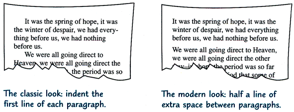
Space between paragraphs
Just as you add a space after the period to separate
sentences, you must signal where a new paragraph begins. There are a couple of
ways to do this. The first method is the most economical, allowing room for more
words on the page; the second adds more white space.
-
For a classic, traditional look, indent the first line
of each paragraph: .15″ is a useful standard. It’s customary, though, not to
indent the first paragraph under a heading because it’s obviously a new
paragraph. [First-line indents are also thought to work better in combination
with justified text, whereas extra space between paragraphs is more effective
for ragged-right text.]
-
For a contemporary, uncluttered look, don’t indent the
first line and do leave a space between paragraphs. Don’t press the
enter key
twice, though—that generally creates too much space. Instead, adjust the space
before or after each paragraph (but not both)—approximately half a line of
additional spacing is the norm.
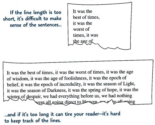
Line length
Readability is affected by line length. A very general rule
is an average of 10 to 12 words per line for a serif font and 8 or 9 for a sans
serif font. [Another rule of thumb is approximately 1½ alphabets or between 40
and 60 characters.]
Alignment
You can change the alignment of selected text in a flash.
Simply click one of the alignment buttons on Publisher’s Format
toolbar [or Word’s Formatting toolbar or Home
tab] —the buttons are shown below next to the descriptions of the four ways to
align text:
 Flush left. All the lines align on the left margin, with the right edge
uneven, or “ragged,” as in this book. This alignment is recommended for most
body text because it’s the most readable. [You can also use the keyboard
shortcut Ctrl+L.]
Flush left. All the lines align on the left margin, with the right edge
uneven, or “ragged,” as in this book. This alignment is recommended for most
body text because it’s the most readable. [You can also use the keyboard
shortcut Ctrl+L.]
 Flush right. All the lines align on the right margin, with a ragged left
edge. The eye struggles to find the beginning of each line, making reading
difficult, so this alignment’s uses are limited—for example, right-aligning a
caption along the left side of a picture. [The keyboard shortcut for this is
Ctrl+R.]
Flush right. All the lines align on the right margin, with a ragged left
edge. The eye struggles to find the beginning of each line, making reading
difficult, so this alignment’s uses are limited—for example, right-aligning a
caption along the left side of a picture. [The keyboard shortcut for this is
Ctrl+R.]
 Centered. Text is not easily readable, but works well in short amounts as
in invitations and announcements. It also offers a touch of formality.
[Press
Ctrl+E to center text.]
Centered. Text is not easily readable, but works well in short amounts as
in invitations and announcements. It also offers a touch of formality.
[Press
Ctrl+E to center text.]
 Justified. Text is aligned on both the left and right margins. Don’t
justify text if the lines are short or the font is large; it can create
unsightly gaps and slow down reading. (If you do justify text in other
circumstances, be sure that Publisher’s automatic hyphenation is turned on.)
[Ctrl+J
will justify text.]
Justified. Text is aligned on both the left and right margins. Don’t
justify text if the lines are short or the font is large; it can create
unsightly gaps and slow down reading. (If you do justify text in other
circumstances, be sure that Publisher’s automatic hyphenation is turned on.)
[Ctrl+J
will justify text.]
Adding emphasis
Well-set type is smooth and rhythmic, and adding emphasis
should be done in a subtle way, without disrupting the even texture of the page.
You can achieve this if you follow the basic guidelines below.
-
For emphasis in body text, use italics instead of underlining. A
second color often works well.
-
Use all capital letters in small doses.
-
Use small caps
instead of regular-size caps,
especially for a.m., p.m., and
acronyms like unicef or ram.
-
Set off a section that you want to emphasize, such as a long
quotation, with some space before or after the paragraph.
-
Italicize book or magazine titles. Use quotation marks around the
titles of shorter works like songs or magazine articles.
Punctuation and special characters
Apostrophes and quotation marks
Publisher automatically gives you typographer’s apostrophes
( ’ ) and single ( ‘ ’ ) and double ( “ ” ) quotation marks (often called “smart
quotes”), rather than foot ( ' ) or inch ( " ) marks. [Word
also does this by default.] If you do want inch or foot marks for
measurements now and then, that’s easy, too: simply hold down the
ctrl key while you type the
quotation mark or apostrophe. [In Word, press
Ctrl+Z
to reverse the AutoFormat As You Type correction.] These contribute greatly to your
publication’s professional look.…If you’ll be typing lots of measurements, it’s
easy to turn the smart quotes option off [do this in Word
on the AutoFormat As You Type tab of the AutoCorrect Options
dialog. Alternatively, you can
assign keyboard shortcuts to typographer’s foot and inch marks—the prime ( ′ )
and double-prime ( ″ ) characters found at 0162 and 0178 in the Symbol font and
also included in the expanded character set of most Unicode fonts at 2032 and
2033.]
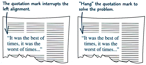
When you put quotation marks around
a quote in a large font size, such as a pull quote, hang the quotation marks
outside the block of text to keep the text aligned.
Dashes
There are three kinds of dashes, each a bit longer than the
other. You don’t need to put spaces before or after dashes.
-
Use the hyphen (-) for hyphenating words.
-
Use the en dash (–) where you would use “to,” as in
“business hours are 10 a.m.–5 p.m.,”
in a range of numbers (pages 17–25), or to link certain compound adjectives like
“the Tokyo–Hong Kong flight” or “anti–blood clotting serum.”
-
Use the em dash (—) instead of parentheses—as is done
here—to set off a parenthetical phrase. On the typewriter, two hyphens stood in
for this dash, so Publisher cleverly substitutes an em dash when you type two
hyphens. [So does Word. Although an em dash is used as described in most of the
English-speaking world, it has become increasingly common in the UK to use
instead an en dash with a space on either side – like this. For that reason, if
you type a space, then a hyphen, then another space, Word converts this into a
spaced en dash—but not until you finish typing the following word. Also,
note that (even in the UK) an em dash is used to denote that speech has
been broken off in mid-flow, as in:
The Queen turned crimson with
fury, and after glaring at her for a moment like a wild beast, began
screaming “Off with her head! Off with—”
“Nonsense!” said Alice very
loudly and decidedly, and the Queen was silent.]
Symbols
Publisher makes it easy to accent letters (café) and to use
symbols such as © (copyright) and ™ (trademark). [So does
Word. The examples given are actually built-in AutoCorrect entries; for other
symbols, see
“How can I insert special characters, such as
dingbats and accented letters, in my document?”]
Superscript and subscript
Carbon dioxide becomes CO2 when you
subscript the 2, and fourth becomes 4th when you
superscript the th. [In Word, you can apply
these properties through the Font dialog, or you can use the built-in
keyboard shortcuts: Ctrl+= for subscript and Ctrl+Shift+= for
superscript. An AutoFormat As You Type option, if you have it enabled,
automatically superscripts st, nd, rd, and th in ordinal
numbers.]
Fractions
Publisher supplies basic fractions: ¼, ½, and ¾.
But if you need others, like 3⅝, Publisher Help can show you how to make
them look elegant. [For
fractions in Word, see “How to create
fractions in Word.”]
The look of display text: headings and headlines
Display text—headings and headlines—is meant to catch the
reader’s eye by being distinctive, evocative, and big: as a general rule,
display text is larger than 14 points.
However, display text works
differently in a publication such as a book or a report than it does in an
advertisement in a brochure or magazine. In the former case, the readers are
already involved and the display text helps them to see the organization of the
publication and to navigate in it. In the latter case, the display text must
capture their imagination so that they’ll read the advertisement.
Choosing a display font
Start by playing around—set the headings in different fonts
and see how they feel. Display fonts have a big impact on a publication
because of their size, so it’s important that they convey the mood you want.
-
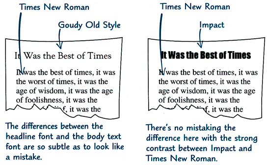
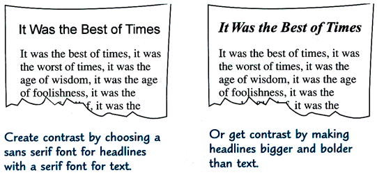
To attract and hold the reader’s attention, there
must be a contrast between display text and body text. Create contrast by
choosing a headline font from a different category (remember serif, sans
serif, and script) than that of your text font—that’s what the designers of
this book did [they used Britannic Bold for headings and Times New Roman for
body text]. Or use only one font in your publication and create contrast by
makings the headings bigger and bolder than the text.
-
Choose a font that’s legible. Because short bursts
of text like signs or headlines can’t rely on the meaning of the surrounding
words for understanding, it must be easy for readers to identify individual
letters rather than words and phrases. Many designers consider sans serif
fonts to be more legible at large sizes than serif fonts.
-
Once you’ve chosen the heading font, use the same
one throughout the publication and use it consistently.
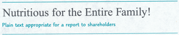
Formatting display text
In Publisher, you can set display text as plain text or you
can use WordArt for display text. [WordArt is also available in Word.]
Use plain, unadorned text for
publications such as reports, in which display text helps organize the page, or
in elegant or formal publications like invitations or awards. Plain text is very
legible, which makes it desirable for critical information like road signs or
telephone numbers. Plain text also gives you control over the spacing between
letters, which is important when letters are set large. You can achieve the
contrast you want by relying on a larger size, a heavier weight, or a different
font. And finally, you might have fewer printing problems when you use plain
text.
Use Publisher WordArt when you want
splashy effects to heighten contrast. You can put white text on a black (or
colored) background, pour text into a shape, add shadows to letters, or twist
and turn text in a variety of ways. [Some of these effects are also available
for plain text in Word.] Once you have placed it in your publication, however,
you cannot directly edit the WordArt. To make changes, you have to reactivate
the WordArt program by double-clicking the WordArt frame.
[In recent versions of Word, WordArt is more fully integrated into the program.]
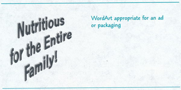
You’ll want to limit the use of
WordArt, though, simply because it is so memorable. Too much of it is
like having a dinner entirely of desserts or a birthday every day of the year. A
maximum of half a dozen words is a good rule.
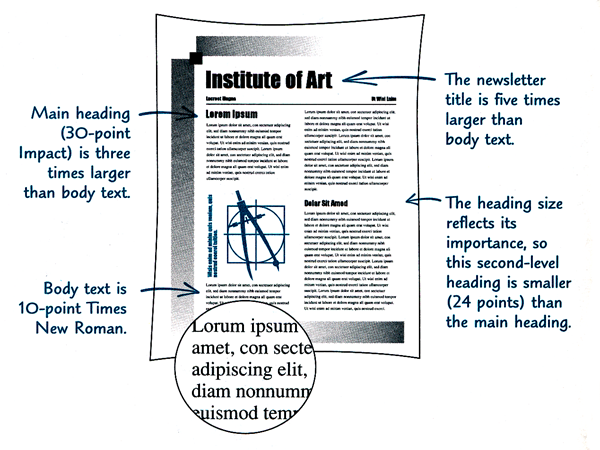
Size and weight
To generate impact, set main headings between two and four
times larger than body text—even five times larger for greater punch. Let your
eye be the judge, but headlines that are much larger and darker than body text
attract the reader’s attention immediately. [For long documents such as books
and reports, headings are not usually so large; in Word 2003 and earlier, default Heading 1 is
14-point Arial, while Body Text is 10- or 12-point Times New Roman; Arial is
admittedly heavier than Times, however, with a greater x-height.] You can also
use color very effectively in headings. [Word 2007 and
above do use color for headings by default.]
Another effective way to set off
subheads and make their associated text clear is by placing a horizontal line
(also called a rule) above the heading. [You can do this in Word by
applying a top border to the paragraph; for instructions, see
this article for Word 2003 and earlier and
this one for Word 2007 and above.]
Make sure that the size of the
heading reflects its importance—the more important the heading, the larger its
size. Larger sizes help readers figure out where to look on the page, and
smaller subheads pull them along through the story.
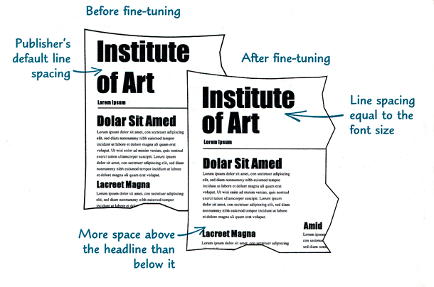
Spacing
In general, there should be less spacing within a
headline (between the letters and between the lines if it’s a two-line headline)
and more spacing around (but not below) it. This gives the headline cohesiveness
and helps it stand out from the body text. [In Word, you
can adjust the line spacing in the Paragraph dialog and character spacing
on the Character Spacing or Advanced tab of the Font
dialog.]
Capitalization
Be judicious in your use of all capital (uppercase or all
caps) letters—they’re often not as legible as a mix of uppercase and
lowercase letters and they don’t necessarily look more important.
Why uppercase and lowercase? When printing was
done with letters made from lead, type was kept in shallow wooden cases
stored on racks. Each font required two cases, one for the small letters,
numbers, and punctuation, and the other for the capital letters. Since the
small letters were used more frequently, they were kept in the lower,
more easily reached case, and the capital letters were kept in the upper
case.
The look of fancy first letters,
captions, and other special text
There are other kinds of text that don’t readily fall into
the body text and display text categories—sidebars (information that might
interest a reader, but that isn’t essential), fancy first letters that attract
the eye to the page, captions with pictures, and pull quotes (excerpts from the
body of the story, often set large). Use these elements in moderation, however,
or your publication could look tacky and confusing. And once you’ve chosen the
font and style for any of these elements, use them consistently throughout the
publication.
-
If you do use all caps,
limit them to very short headlines set large and pay particular attention to
the spacing between the letters. Also consider using all caps fonts, such as
those from the Copperplate family, whose letters are specifically designed
to fit together well.
-
If you don’t use all
caps, be consistent in your capitalization of headings and subheadings
throughout your publication—capitalize the first letter of each word or just
the first letter of the first word.
-
Whatever you do, don’t set script fonts in all caps!
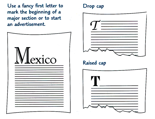
Fancy first letters
It’s easy to create a fancy first letter (also called a
drop cap or raised cap) in Publisher. If the font doesn’t work with
your publication, you can change it to match the heading font, or use another
font that complements the style of your publication.
[There are even special fonts that consist entirely of fancy capital letters,
sometimes in the style of the “illuminations” in hand-lettered medieval texts. In Word, use Format |
Drop Cap or Insert | Text | Drop Cap to make a drop cap or a large
initial in the margin; for a raised cap, merely increase the font size.]
If you have more than one fancy
first letter on a page, scatter them and make sure they don’t line up along the
top of the page. A fancy first letter often takes the place of a heading, so you
don’t want it at the bottom of the page either.
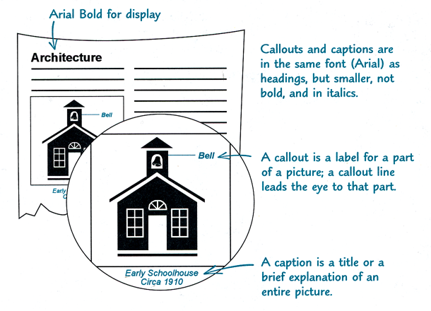
Captions and callouts
When you mix fonts in your publication, it’s a good idea if
the font you use for captions and callouts is related either to the body text
font or to the display font, as shown in the following illustration.
You’ll notice, though, that the designers of this book used a third font
(Blueprint) for the captions and margin notes—proving that it’s okay to break
the rules sometimes!
Pull quotes
A pull quote extracts a short statement from the story to
add visual interest to the page and to attract the reader’s attention.
-
Make the pull quote a
different font and at least 6 points larger than body text to attract the
reader’s eye.
-
Keep the pull quote short (no
more than four or five lines) or you’ll discourage people from reading it.
-
Put the pull quote on the same
page (or on the facing page) with the text it was pulled from, but not in
the same paragraph. After reading the same thing twice, readers might think
you made a mistake.
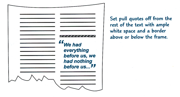
An appealing way to call
attention to a pull quote is to enclose it in giant quotation marks, as shown in
the illustration here. If you do this, be sure to hang the quotation marks
outside the even margin of the quote. [You can find giant quotation marks in
some symbol fonts, or you can increase the point size of quotation marks in the
font used for the pull quote; if the latter method is used, it may be necessary to
lower the quotation marks on the Character Spacing tab of the Font
dialog.]
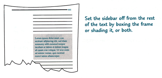
Sidebars
A sidebar contains information that isn’t vital to
understanding the main text, but that adds interest or additional information.
Sidebar text can be the same font and size as body text or the same font (in a
larger size) as the captions. Put the sidebar within a page or two of the
related text.
[Recent versions of Word provide premade sidebar “building
blocks.” On the Insert tab of the Ribbon, in the Text group, click
Text Box. In Publisher, they’re also on the Insert tab, under
Page Parts in the Building Blocks group. (In older versions, find
them through Insert | Design Gallery Object...]
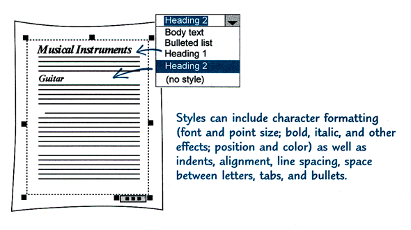
Using text styles for fast and consistent formatting
Text styles are formatting descriptions that you can use to
quickly apply text formatting on a paragraph-by-paragraph basis. Text styles
contain all the formatting information that you need: font and font size,
indents, line spacing, tabs, and special formatting such as numbered lists or
character spacing. By using text styles, you can make even complex formatting
easy by just choosing the style name. And by using text styles for specific
purposes—a heading style for headings, a list style for lists, and a body style
for body text—you can maintain a consistent design throughout your story, your
entire publication, and even multiple publications.
Text styles can come from a variety
of sources. Some text styles are created by Publisher, such as the Continued-On
Text style, which Publisher uses when a “Continued on page…” notice is
automatically included in your text frame. [Word also uses some styles
automatically; among these are Header, Footer, Caption, Footnote Reference, and
Footnote Text.] You can create other text styles in your word processor as you
write your text, and those styles will be included in Publisher when you import
the file. You can also define your own styles in Publisher, import text styles
from other publications, or use text styles that have been saved in a template.
[All of these are true in Word as well, and there are even more good reasons for
using styles in Word.]
This article copyright © 2000, 2017,
2023 by
Suzanne S. Barnhill. New illustrations
(not the originals) were added by Dave Rado, webmaster of the Word MVP FAQ site,
when it was published there; the illustrations in this version are scans from
the original printed manual. Except for the
bracketed text, both text and illustrations are
copyright © 1991–1996 by Microsoft. |